Riyadh Air’s corporate website, campaigns and email.
Before ticketing opened, Riyadh Air’s corporate website was the airline’s only public site. I joined after the launch site went live and designed new sections for it. I then redesigned the site on Rx 2.0 and designed the campaign pages and the email programme, over more than a year.
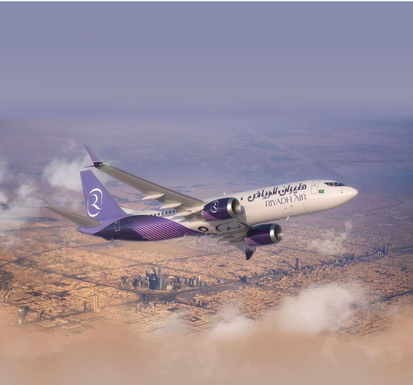
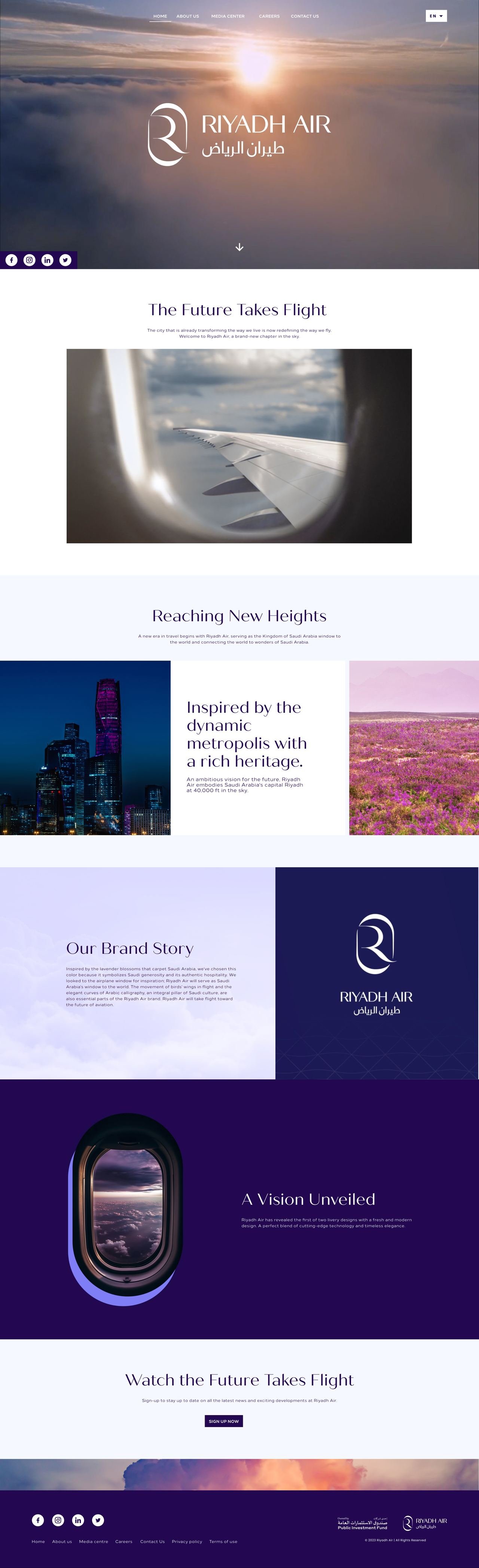
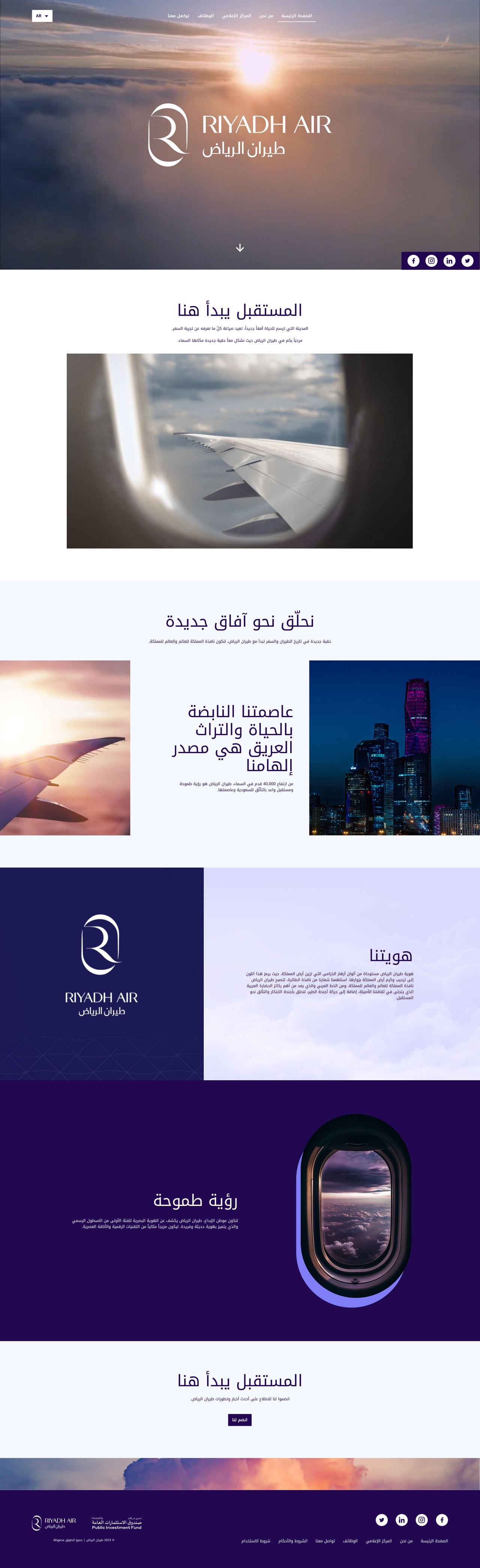
Arabic and English, as equals.
A digital airline, proud of Riyadh: Arabic had to carry the same weight as English, and most visitors would come on a phone. A local team built the launch site on that rule, and it was live when I joined. Every section I designed after that came in four versions too, mirrored right to left in Arabic.


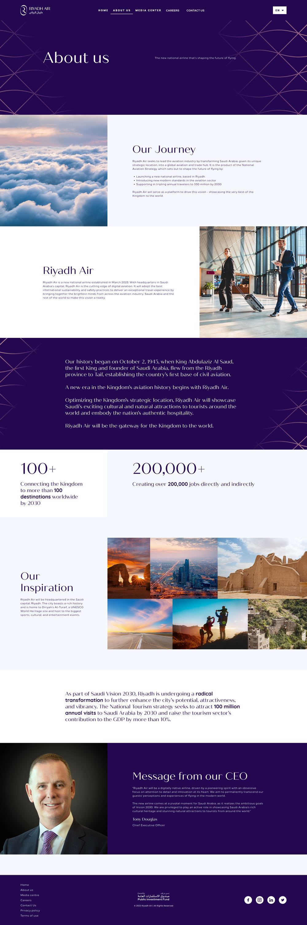
Our Journey milestones, sponsorship and partnership sections with an enquiry form, and a Values page. Each one designed in English and Arabic, for desktop and mobile.
Rx 2.0 was built for ticketing. The site needed to tell stories.
Riyadh Air’s Rx design system was created by a dedicated team for the ticketing site. I moved the corporate site onto Rx 2.0, using its components as they were and designing the storytelling pieces the library didn’t include.
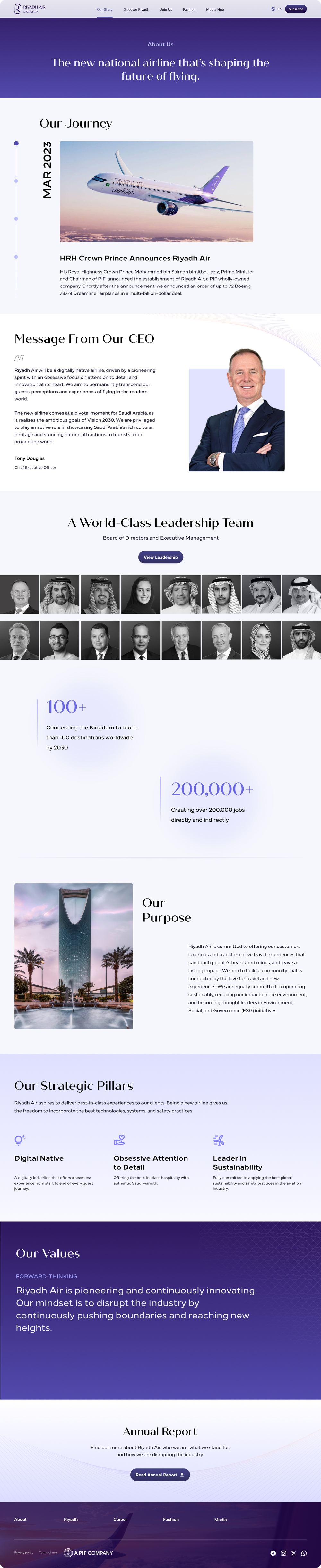
A ticketing site moves people through a task; a corporate site tells a story. Everything new stayed on the system’s tokens, so the result reads as Rx 2.0, not a separate style.
- 01Buttons, form fields and checkboxesEvery call to action and the newsletter sign-up, as built.
- 02Colour, gradient and dark-mode tokensPage header bands and the dark indigo sections.
- 03Arabic font switch and 4 px spacingOne set of styles for both languages.
- 01Aircraft spec cards and feature rowsOne figure per card: range, wingspan, speed, capacity.
- 02Chapter openers and story carouselsA full-bleed image and a one-line promise per cabin class.
- 03Timeline and article cardsDated milestones for Our Journey; category, date and share for the newsroom.
A front page that changes with the news.
The home hero is a full-width video stage with one line and one call to action. Each launch, from the uniforms to new routes, takes over the front page without a redesign.
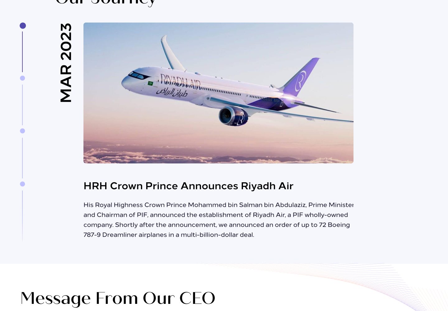
The airline’s story, one date at a time.
Our Journey became a vertical timeline: each milestone pinned to a month and year, with one image and one headline. A two-year-old airline’s history reads as momentum, not a list of press releases.
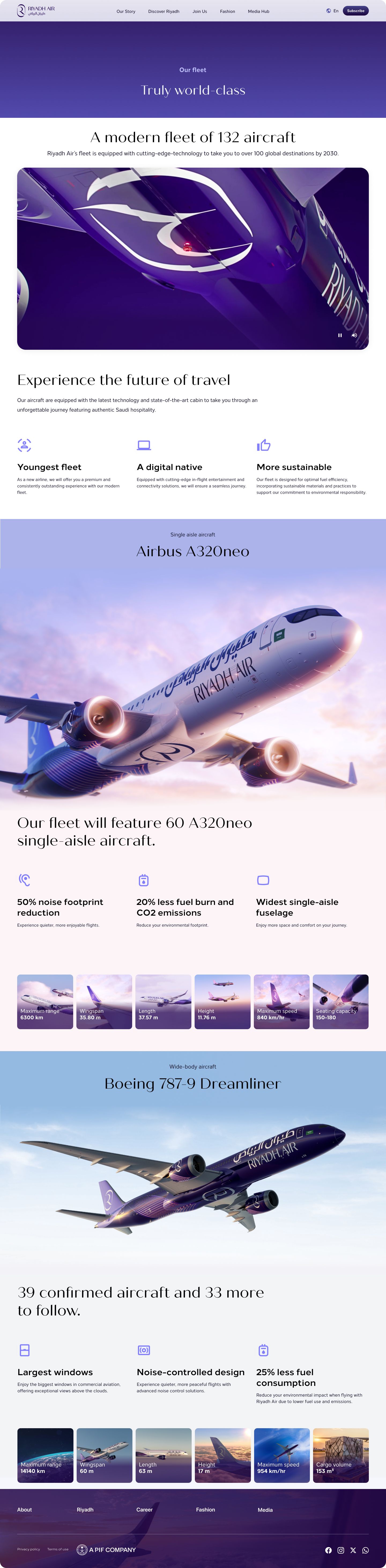
The fleet, told as one continuous story.
The fleet page is a single scroll from the livery to each aircraft and its specs. The imagery was created for this page, so every section blends into the next with no hard break between aircraft. Scroll the page to see it the way visitors did.
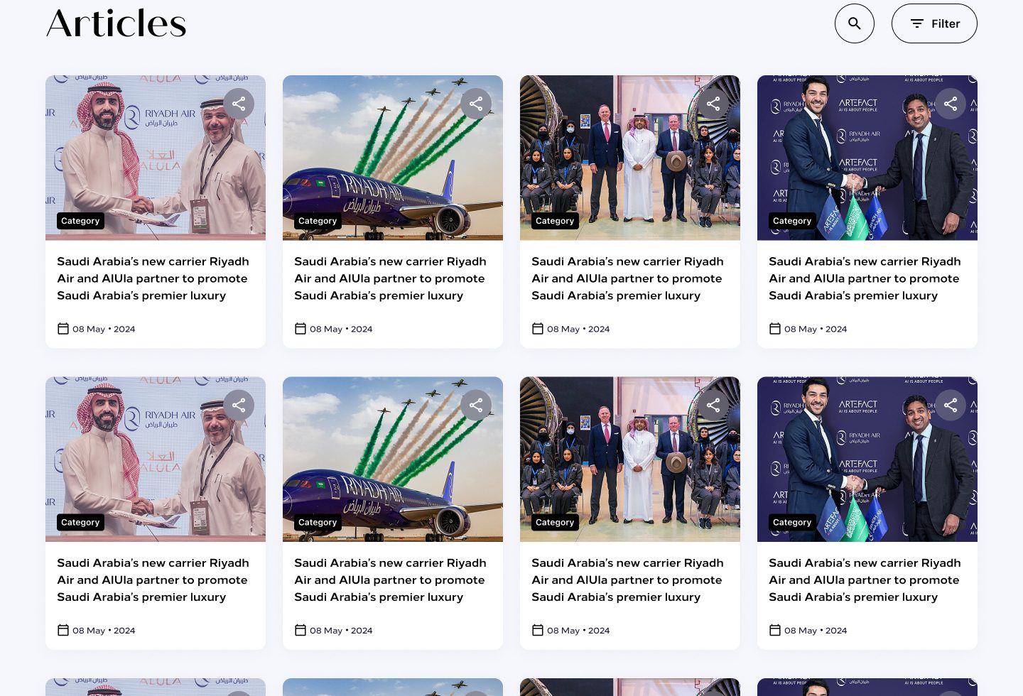
Built for the next hundred articles.
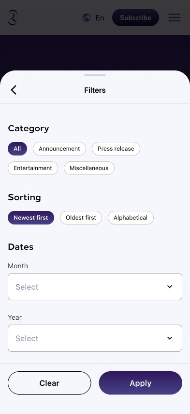
Two press releases at launch became a newsroom: article cards with category, date and share, plus search and filters that open as a full-screen sheet on mobile.
Three launches, each with its own stage.
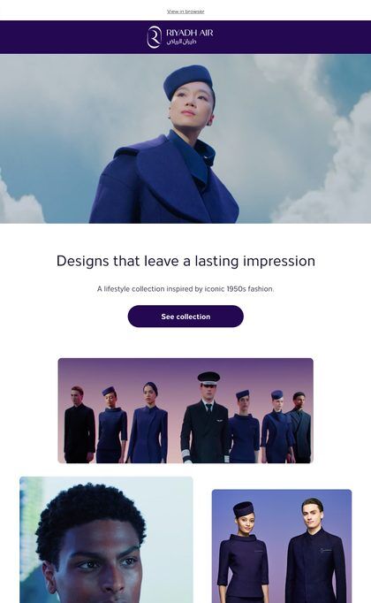
I designed the campaign pages for the uniform collection, the sonic identity and the new cabins. Fashion and sonic ran in two acts, a teaser and then the full reveal: the designer before the collection, the sound before the story.
Painting the sky purple.
The uniform launch opened on the designer, not the clothes. Act 1 introduced MA and the atelier; Act 2 revealed the collection.
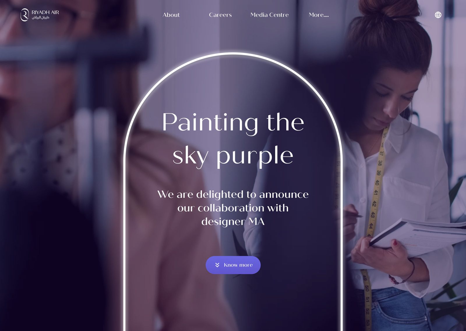
The reveal told as a story, in eight beats.
Instead of a product page, the reveal reads like an editorial: the designer first, then the partnership, her words, the making, and only then the uniform.
- 01The invitation
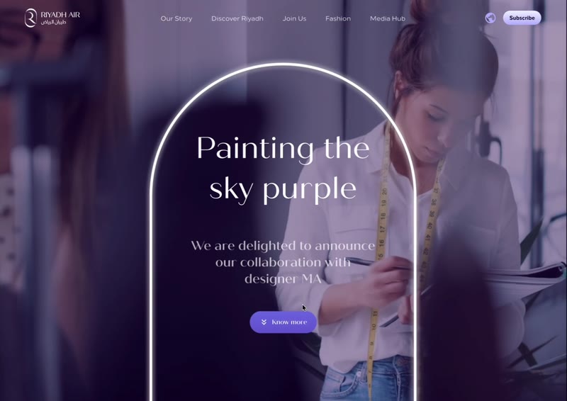
An arch that frames the designer, not the uniform.
- 02Meet the designer
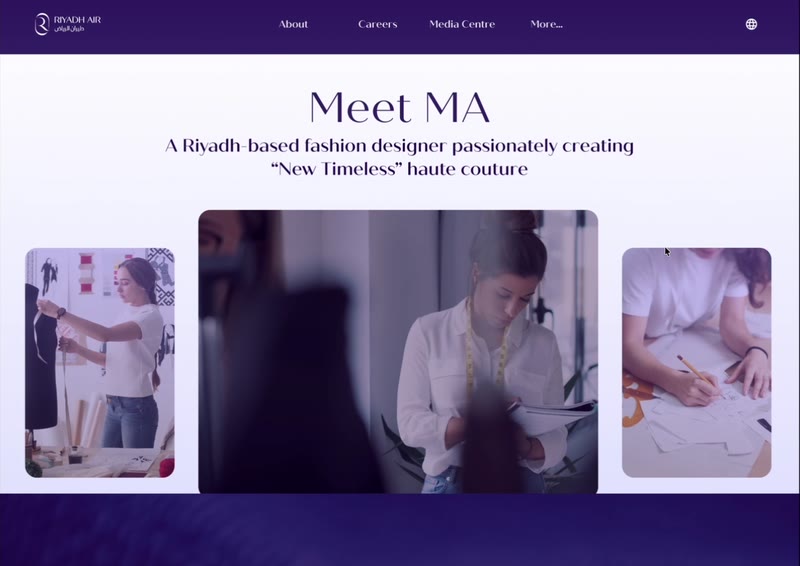
MA introduced through her studio.
- 03The collaboration
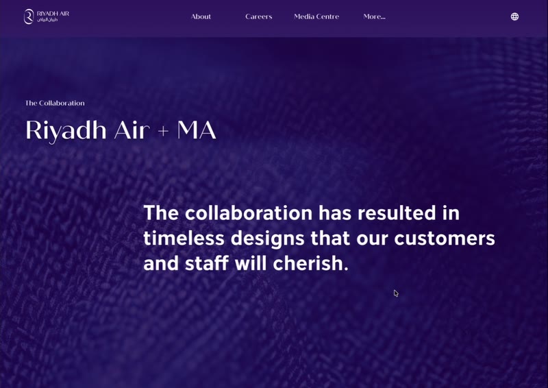
Why Riyadh Air chose her, in three lines.
- 04In her words
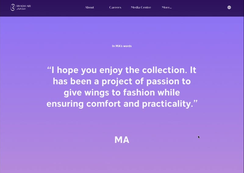
Her quotes, set large and given room.
- 05Behind the scenes
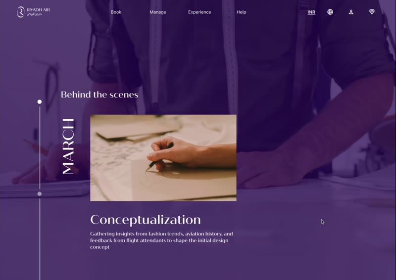
The making of the collection, month by month.
- 06The details
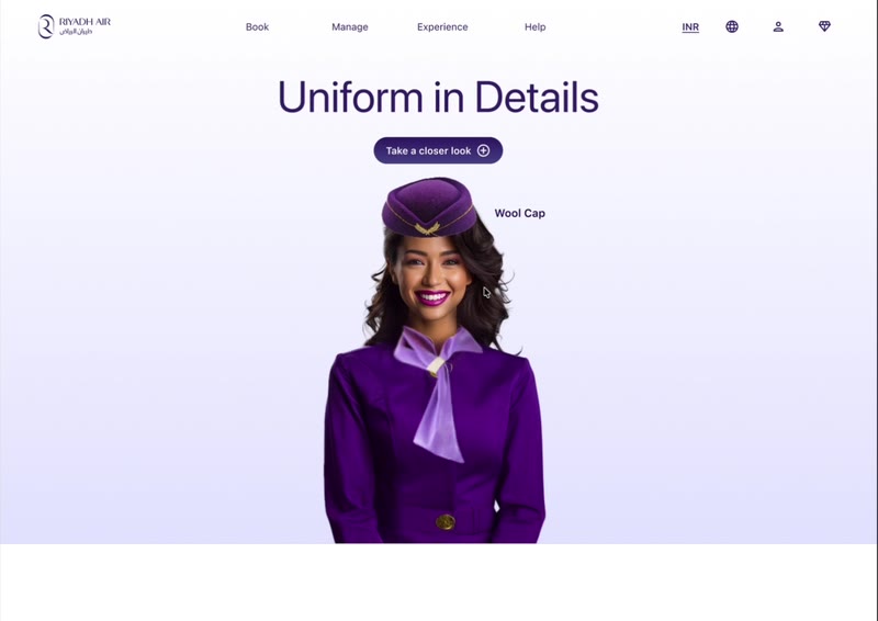
Hotspots on the uniform, one piece at a time.
- 07The craft
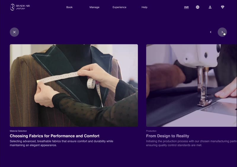
Fabric, fitting and finishing, as a carousel.
- 08Sustainability
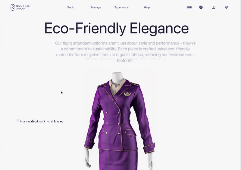
What the collection is made from, and why.
Motion that carries the narrative.
Each animation does one job: it reveals the next part of the story as you scroll, so nothing competes with the photography.
Rebuilt for the phone, not shrunk.
The arch hero fills the screen, side-by-side sections stack, carousels become swipeable cards that peek at the next one, and the timeline gives each month its own screen.

The sound before the story.
The sonic identity launched as sound first: a page to play the piece, then the story of how 13 musicians made it, performed across five places in Riyadh.
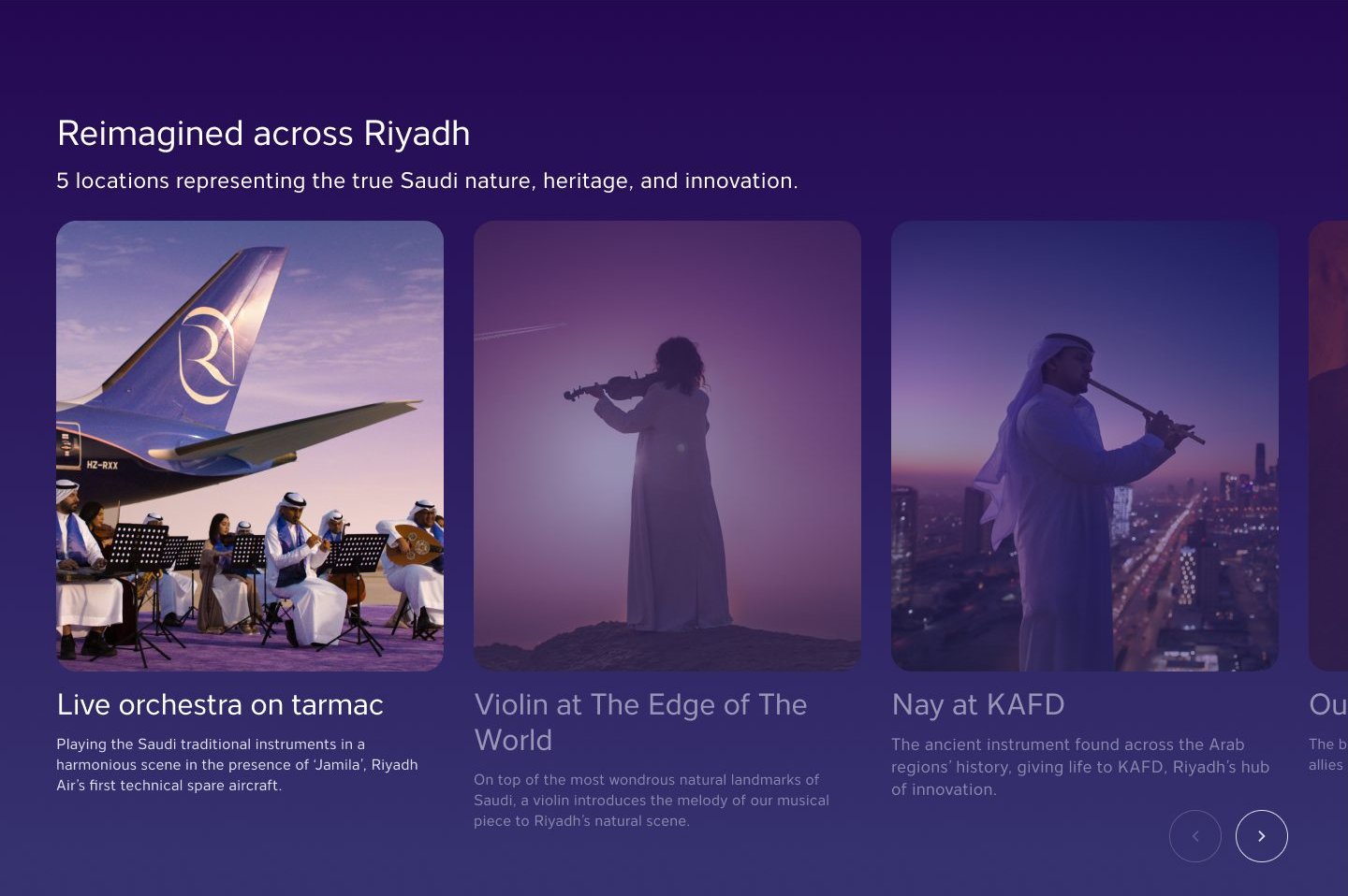
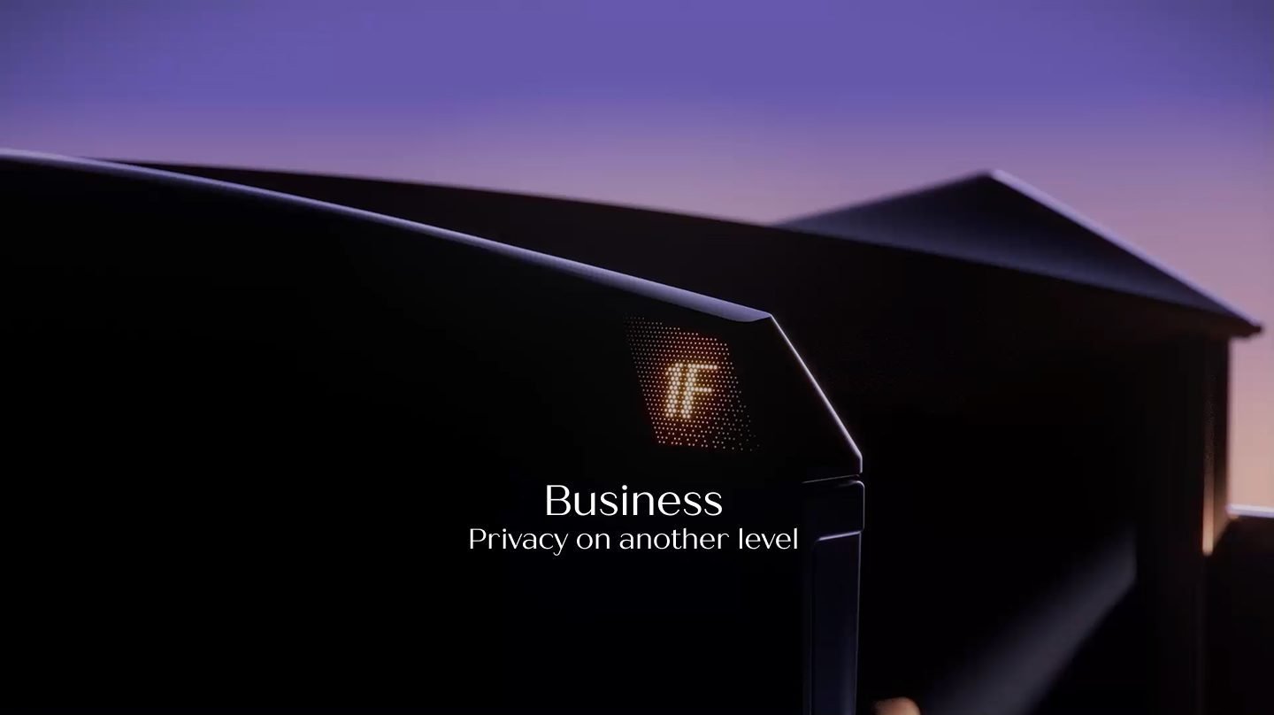
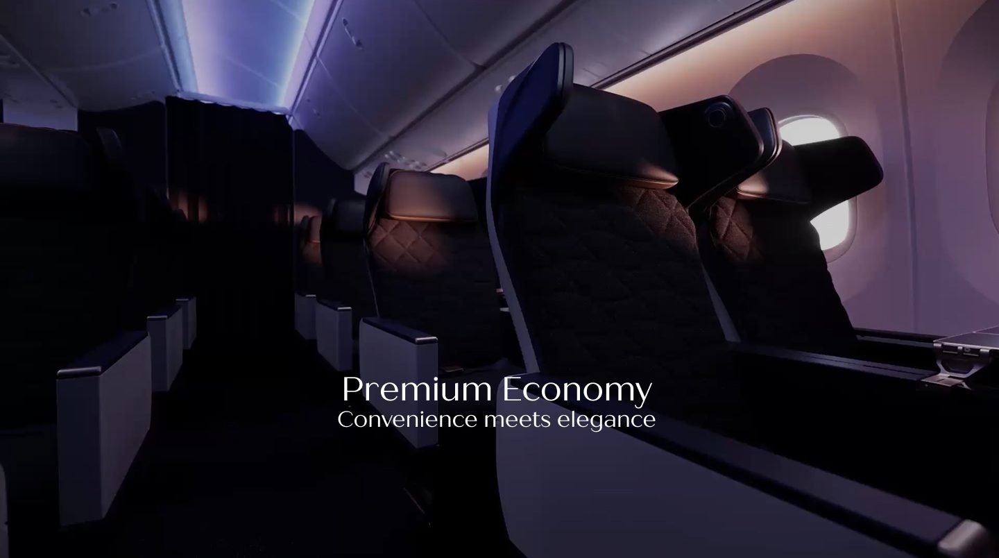
Four cabins, told as chapters.
Each cabin class opens with a full-bleed image and a one-line promise, then a story carousel of its features.
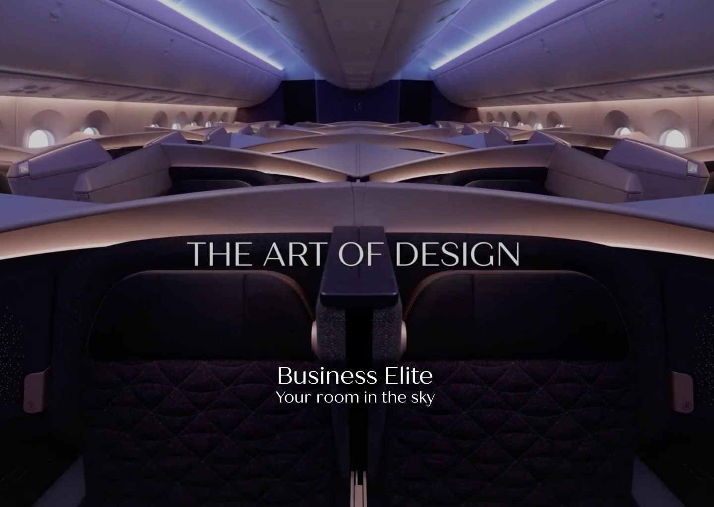
An email system for every inbox.
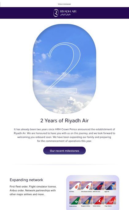
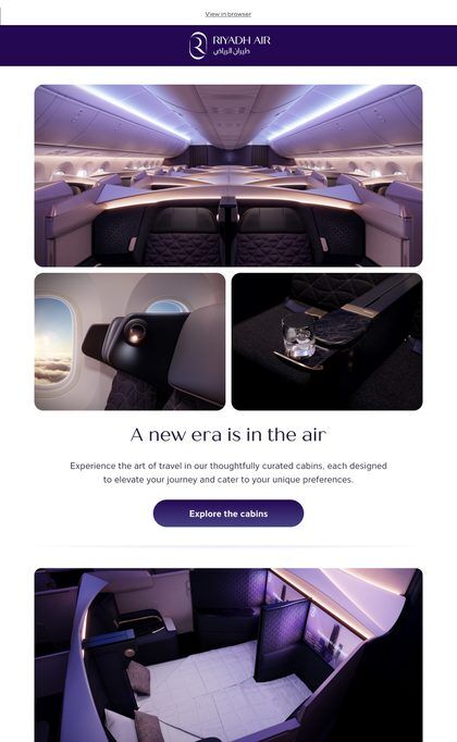
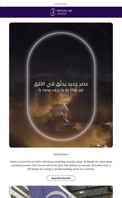
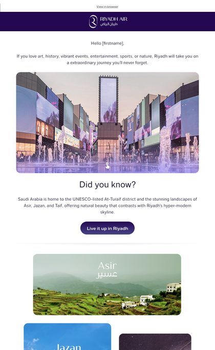
Every campaign used to arrive as a one-off email with its own image sizes. I rebuilt the emails as modules with fixed image slots, which became five templates in Adobe Journey Optimizer and a checklist every send goes through.

- 01Gradients
Outlook for Windows renders email with Microsoft Word’s engine, which drops CSS gradients. The purple header is exported as an image instead, so it looks the same in Outlook, Gmail and Apple Mail.
- 02Fonts
Brand fonts only load in a few apps, such as Apple Mail; Gmail and Outlook ignore them. Each language has its own fallback order, so an inbox that can’t load the brand font picks the closest one it has, ending in a font every device ships with.
- English · title
- Quiche Sans → Avenir → Roboto → Arial
- English · body
- Loew → Montserrat → Tahoma → Arial
- Arabic
- Noto Kufi Arabic → Segoe UI → Noto Sans Arabic → Arial Unicode MS
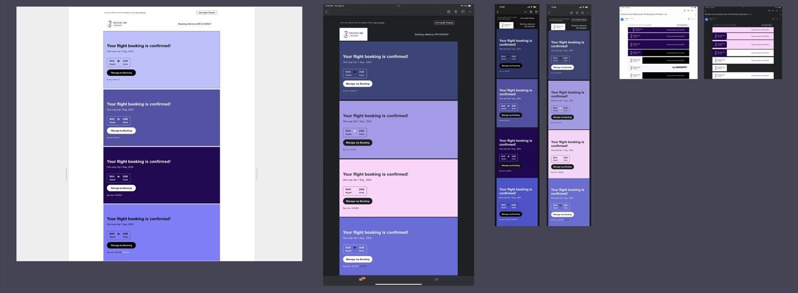
- 03Dark mode
In dark mode, apps like Gmail and Outlook invert background and text colours but leave images alone. Brand purple lives where they can’t recolour it: the header image and the buttons.
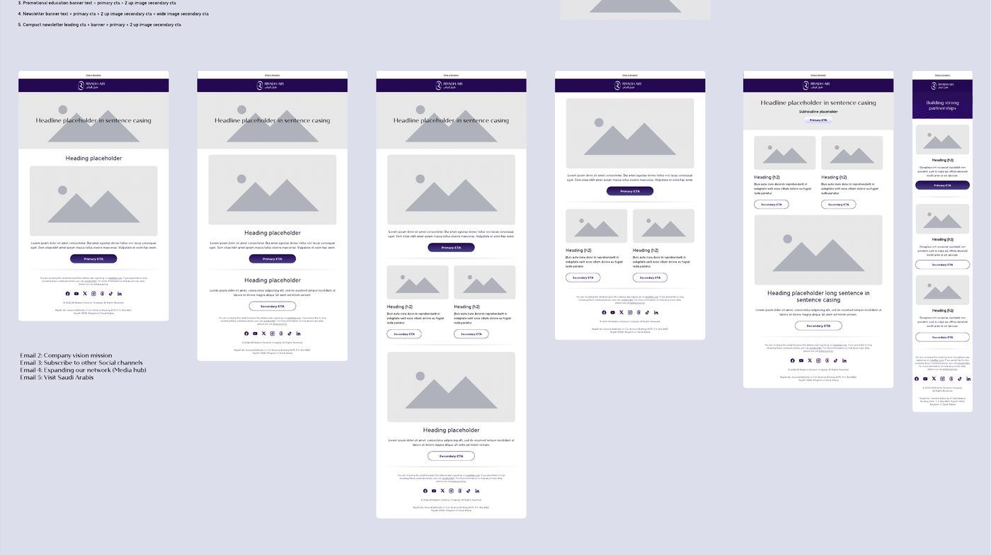
A research-led proposal for Rx 3.0.
When ticketing moved to Rx 3.0, we proposed moving the corporate site too, so reading about the airline and booking a flight would feel like one product. This was my final delivery on the project.

- 01Research first
We benchmarked 16 brands, 7 of them airlines, to set the structure of each page before choosing its Rx 3.0 components.
- 02One product
The corporate site and ticketing would share one design system, so moving from a story to a booking feels seamless.
- 03New pages
The proposal added the pages a site with ticketing needs: lounges, partnerships and a media hub.
A milestone journey, designed in motion first.
A scroll-driven journey through the airline’s milestones, animated in the wireframe before any visual design: each moment arrives as you scroll, with the aircraft passing through. The motion became the inspiration for another microsite being designed at the same time.
- Our Journey timelineFrom a placeholder carousel to the real 2023–2024 milestones.
- Sponsorship and partnershipsSections for news such as Atlético de Madrid, with an enquiry form.
- Values pageThe airline’s values, designed in English and Arabic.
- Handoff kitEvery component in desktop and mobile, with content limits for developers.
The launch site and Rx 2.0 ran live until the ticketing site replaced them. Shown here from the original design files.
A US telecom company
HR transaction AI chat · private case study